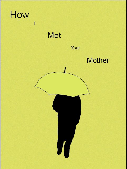


For Green Eggs and Ham, all I used was the green eggs and ham. Because, the view would look at the cover, and they would know what the book is right off the bat. The Vow, a simple ring was used to make the poster stand out. When one gets married, the vows and the rings are used to show the ‘ever’ in ‘forever’. On How I Met Your Mother’s poster, you have to watch the show to understand the yellow umbrella. That’s the only way to understand the story behind the poster.
I used a more simple color, and less images to simplify the posters. I mean, Green Eggs and Ham was, you could say, more ‘complex’ compared to the other posters.
My least successful would have to be the Green Eggs and Ham poster, because it wasn’t as simple as the other posters. Personally, it seemed a little bit too much for a minimal movie poster. My most successful would have to be the How I Met Your Mother poster, because there’s more of a meaning behind the poster. There’s more of a symbol behind it. Plus, HIMYM is the best!

I love this one, because Spiderman is the best! Plus, I love the creativity behind the poster. Everything worked out in the end. It has a double picture effect. This is my absolute favorite. I might just have to make it my wallpaper!


