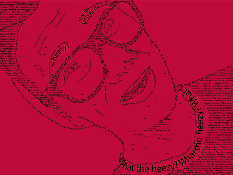
I chose to do a type portrait of myself. The words that I chose to type was “What the heezy?”, because that the quote that I say ALL the time. It’s my statement. Nobody can have it. I called it.
I chose to do a type portrait of myself. The words that I chose to type was “What the heezy?”, because that the quote that I say ALL the time. It’s my statement. Nobody can have it. I called it.

I chose to do my infographic on The Amazing Spider-Man. The title of this project is “The Amazing Powers of the Amazing Spider-Man”, because the infographic itself is about Spider-Man’s powers and abilities. I thought about the color scheme, and I used a simple red and blue template. Because, Spider-Man’s main colors are red and blue. But, I couldn’t just use a solid blue for the background, so I used a slight gradient. When arranging the information, I had the info go around the focal point, representing the abilities Spider-Man has in different parts of his body. Personally, I think people would be interested in reading this, because it has a lot of pictures, which are pretty cute, and it has a good amount of good information.
At the end of the day, I would say I am pretty proud of my final project. I put a lot of work into it; deciding to draw it out before I actually started designing it. All and all, with all honesty, I love Illustrator. It is really fun and a great experience. I am very confident with Adobe Illustrator. My favorite project would have to be this one. Because, we had to use all of our skills that we have learned, and use it for a final project.
Yes, yes I have experience in Photoshop; I used it last year in Web Page Design. I just hope to learn how to edit again. Or, just using all of our skills at the end of the semester, hand and hand, and create a master project
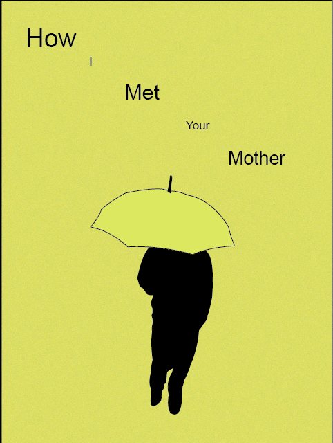


For Green Eggs and Ham, all I used was the green eggs and ham. Because, the view would look at the cover, and they would know what the book is right off the bat. The Vow, a simple ring was used to make the poster stand out. When one gets married, the vows and the rings are used to show the ‘ever’ in ‘forever’. On How I Met Your Mother’s poster, you have to watch the show to understand the yellow umbrella. That’s the only way to understand the story behind the poster.
I used a more simple color, and less images to simplify the posters. I mean, Green Eggs and Ham was, you could say, more ‘complex’ compared to the other posters.
My least successful would have to be the Green Eggs and Ham poster, because it wasn’t as simple as the other posters. Personally, it seemed a little bit too much for a minimal movie poster. My most successful would have to be the How I Met Your Mother poster, because there’s more of a meaning behind the poster. There’s more of a symbol behind it. Plus, HIMYM is the best!

I love this one, because Spiderman is the best! Plus, I love the creativity behind the poster. Everything worked out in the end. It has a double picture effect. This is my absolute favorite. I might just have to make it my wallpaper!

My master studies are are the simple grin, and the extravagant smile!

The sloth is used as an emoji to describe that you’re being lazy. Plus, Sloths are just amazing, and deserve to have their own emoji! Spiderman is used to show that you’re energetic, or to show heroism.
![]()
In my logo, I gave it more of a cartoonish look and feel. Cartoon is my style, but with that said about my style, it’s a double meaning. I gave my logo my hairstyle and glasses that I wear. I made the face a skull, because that’s all I am. I’m skinny mini; all I am is skin and bones. The logo is not only a symbol, but it’s a combination of symbolism and using my initials. It is hidden within the glasses and and the tongue. It’s very sneaky. I only made one logo, because I fell in love with it when I did a quick sketch of it. Personally, I thought it was creative, so I kept to it.

The three animals that I used, was a Prairie Dog, a turtle and a sloth. Of course. I wanted the people notice the animals first; that’s why the silhouettes adds so much emphasis. They would notice the animals first, then their eyes will drift off to the gradient background and the “Roo Zoo” letters. To get the stamps to be united in some way, was by adding “Roo Zoo”. Plus, the 10¢ was located in the same position in every stamp. The scheme was all black for the silhouettes. Personally, my most successful would have to be the Prairie Dog, because it really does look like a Prairie Dog, even with the negative space.
Honestly, I really like my finished product. At first I thought it would be hard to just jump in and do a self-portrait, but actually, it was fairly easy. Probably the hardest part would have to be the hair; that part was very difficult. Other than that, I am really satisfied with my self-portrait. I shall pat myself on the back.

At the end of the day, I had a total of fifteen layers. All I can say is, the only tool I used, was the power of the pen tool. For every part of the face, I used a base lay, shadows, and highlights. Just because it makes things easier. If I were to have everything in one layer, it would get too messy, and be hard to arrange things. Multiple layers come in handy.

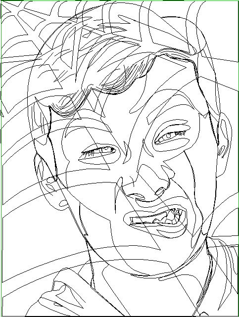
In my self-portrait, I used Adobe Illustrator. The mood that I tried to give was an outrageous one. I see all of these portraits with a serious smile but, I kind of wanted to put a twist on things; so, I decided to use a funny face. I believe that everyone should be able to be themselves, no matter where you’re at. Feel free to be yourself. What about the webs in the background? Well, I’m a HUGE fan of Spiderman, so I thought it would be awesome to interpret some Spiderman in the portrait.
